Jill Krutick: The Road to Shangri La
by Anthony Haden-Guest
Published in Whitehot Magazine
March 2018

Jill Krutick, Moonstone, 2017, Acrylic on canvas, 72 x 120 inches (182.9 x 304.8 cm). 2 panels, 72 x 60 inches (182.9 x 152.4 cm) each. Framed: 74 x 122 inches (188.0 x 309.9 cm). Swirl Series.
There is no such thing as good painting about nothing, declared the manifesto, published in the New York Times on June 13 1943, co-signed by Mark Rothko, Adolph Gottlieb and Barnett Newman. The three Ab-Exes-to-be were still in the throes of their Surrealistic periods at the time – Rothko’s choice to illustrate an equally pugnacious article elsewhere was a canvas called The Syrian Bull – but the observation was as true then as it is now. Just what it might be that good paintings, abstractions in particular, are “about” though, well, that is another story, and often an untold one. But when it comes to the making of Jill Krutick’s remarkable and diverse paintings, these are stories she doesn’t mind sharing. They are tales of how art is made, the intention, the need, the USES OF pure chance.
That large, palely lowering globe on the left of Sailing Day, for instance, is the sun. “It harkens back to my love for Van Gogh. The sweeping movements of color, complemented by core natural elements such as the sky and stars, work in tandem to take me to my most unfiltered, honest place,” Krutick says. “I include the Sun in most of my abstract work as I’m captivated by the intimate relationship between light and dark.” Those are two taut shapes to the right. Were they intended to be sailing ships from the beginning? “No. They weren’t. I put one on the canvas and realized that it actually looked like a sailboat. So then I did it multiple times. I created an iteration of it that happened spontaneously, decided I liked it, and then just went with it.”

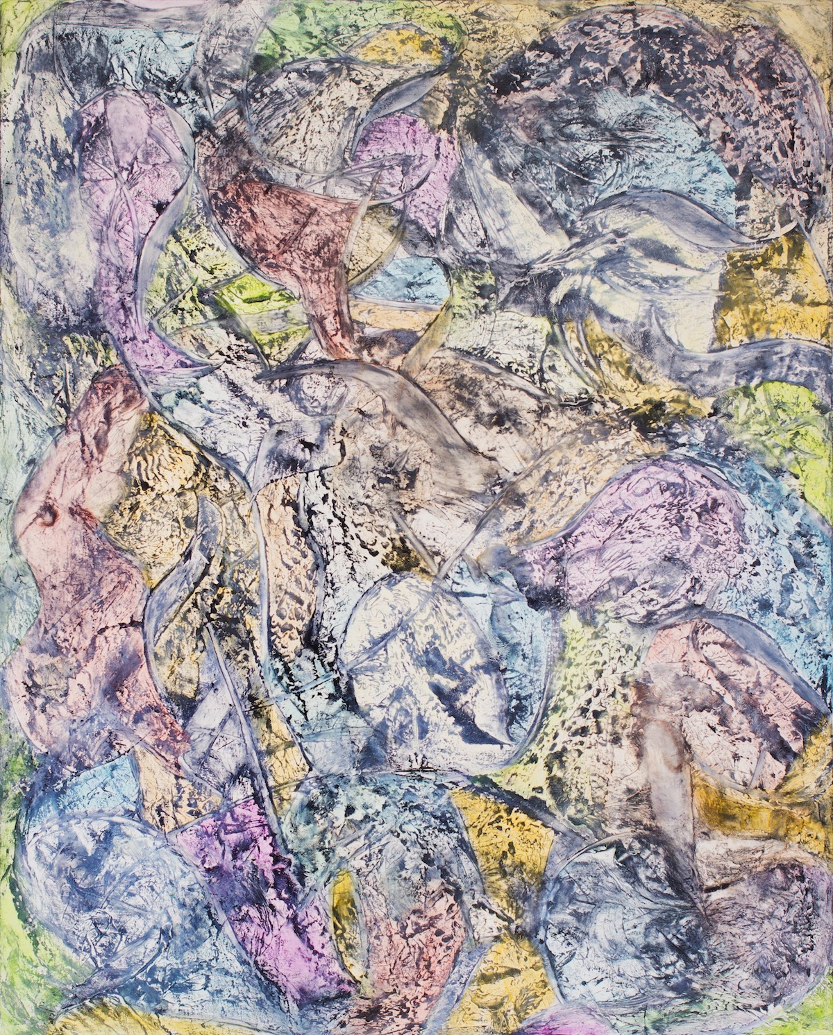
Installation view, Jill Krutick, 2018
Walking On Sunshine happens to be the title of the earliest work by Krutick I have seen. She painted it in 1993, way before she had begun to make art full-time, and it’s an exuberant piece in the manner she calls Geometric. “My instinct was to capture the radiant qualities of the Sun. It ended with this up-and-down and side-to-side motion, a methodology representative of my organized way of thinking about everyday life. From the start, I knew that I wanted to experiment with thick textures that give the sunrays the kind of depth they demand. That was how this style of painting came to be. I knew what I wanted to say, but I knew I wanted to say it in a way I hadn’t explored before. So I took a risk, adopted a new artistic lens, and just let my heart speak.”
Sunlight also burns in Lady Liberty. “That one was inspired from a photograph I saw in the National Geographic magazine,” Krutick says. This was an underwater shot of a surfacing seal bathing in turquoise and yellow. “I loved the color palette,” she says. “I’d never considered putting those two hues together, but when I saw the harmonious music they made, I was so moved by it.” Borrowing from Gerhard Richter’s bag of tools, she used a squeegee to make the lines, then pounded away with it to build up a zone of ambient darkness. She then went on to apply glazes through hours and hours of fingertip pressure to achieve the solar core of light. Lady Liberty is a canvas of vibrant intensity and Krutick does not plan to sell it. “It was damaged in a show once,” she says. “I had it restored and I decided that it was going to live with me.”
Ice Cube Batman is the most recent canvas in a series born under a dark star. “The original Ice Cube was like that big idea that hits when you’re laying restless in bed or the one you write down on a restaurant napkin. It just came to me, and I knew this style would emerge as my artistic fingerprint,” Krutick says. “I was beginning a painting, just shading a square, and I got a telephone call from a friend who had received shattering news. Those who know me are well aware of my compassionate nature. So, it comes as no surprise that after that call, I continued to paint, and what I came up with was a cold shape—my first Ice Cube.”

Jill Krutick, Ice Cube Night, 2016, Oil on canvas, 36 x 36 inches (91.4 x 91.4 cm). To be on view at The National Arts Club Exhibiting Artist Member Show, March 2018.
What does the gold in the middle represent? “A challenge. Challenges can be chilling, but they can melt away if you persevere. The gold in the middle represents the fire from within to overcome the battle and thaw the boundaries of the cube.”
There is an oblong at the center of the square in other paintings of the Ice Cube series, but with Ice Cube Batman suddenly it becomes specific, allowing the shape to glide away from the austerity of Minimalism, to assume the resonance of a mask, and if the canvas has a crackle of pop, this is not just pictorial wit, a stylistic pirouette. Jill Krutick is drawing directly on rich material she accumulated in a time before making art became her wholly consuming career.
“The Batman is basically reminiscent of my days as a Wall Street media analyst when I covered companies like Time Warner and Disney,” she says. “The different characters and brands of those media companies have always flowed through me ever since I was recruited to trace their level of popularity among the public. So the Elektra painting was inspired by a Marvel comic book character and the Batman painting was based on my interpretation of the colors of Gotham City and the Caped Crusader – gold, navy blue and greys. So it’s the passion for iconic media and the concept of the ice cube that collided to create the Ice Cube Batman painting.”
The Giving Tree is another such story painting, based on a children’s book by Shel Silverstein. “It’s my go-to time machine that transports me to my youth,” Krutick says. “The Giving Tree is about a tree from which a little boy would take all the things that he needed to live his life. In the end, only a stump is left. The boy would visit the stump and sit on it and wish he hadn’t taken all of the tree’s resources for granted, because as an older man, he is left with the bare bones of a lifelong companion. So, it’s a very sad narrative, but I wanted to paint a happy version where this tree is filled with light and everybody revels in all its bounty.”

Jill, Krutick, Beach Day, 2016, Oil on canvas, 40 x 40 inches (101.6 x 101.6 cm). Framed: 42 x 42 inches (106.7 x 106.7 cm). Dreamscape Series.
The first version was a small oil; the second, a large oil; and the third, a large acrylic, so Krutick knew just what she was doing when she sat down to make this most recent one. But she also knew that it might turn out completely different compared to her previous Giving Trees. “I start in in one direction,” she says. “And then something else emerges as I paint a few branches and establish the fantasy-like background that prompts me to take a 180 and pursue a different vision. This whiplash actually happens quite often. I might start with a few colors and a concept and end with something completely different. So my paintings don’t always follow the path you’d expect, but this one did. The Giving Tree required layers and layers of acrylic paint and figuring out how to blend the trunk of the tree into the rest of the scene. A lot of trial and error was involved before I achieved the right balance of colors that portrays a regal, glowing figure.”
Krutick had no such rich narrative to fasten onto when she began work on another piece, Petals, but she soon found that she was moving beyond the investigation of pure retinal effect to the channeling of memory, both direct and cultural, second-hand. She knows this bend of the road all too well. “That’s why it’s such an iterative process,” she says. “You start on a journey. Shapes emerge, stories germinate and concepts develop. Some appear earlier on in the process, while others are serendipitous and make their debut towards the end. It’s kind of a mysterious cycle that varies from one painting to the other.” This particular canvas began to assume a defining character towards the end. “When I started shading the canvas, it became pretty obvious that there were petals,“ Krutick says. “It’s two panels. I wanted the first to have a huskier character and the second to have a more delicate quality. On one side there are lighter colors and on the other are more steel-gray colors. The obstacle was to marry them so they looked more like distant relatives than immediate family members.”
The canvas thus became Petals. Almost always, Krutick decides what to name her paintings only after they are done. “It’s a punctuation mark in a sense,” she says. And, as with Ice Cube Batman, her naming can be a perceptual device. Stripped of their titles, Lady Liberty, Petals, and even The Giving Tree might easily be read as referential abstractions, and so it is that, as with Duchamp’s Nude Descending A Staircase or Andres Serrano’s Piss Christ, Krutick’s titles can be considered a useful add-on, a working part of the art.
Jill Krutick, Elektra, 2015, Oil on canvas, 60 x 48 inches (152.4 x 121.9 cm). Framed: 62 x 50 inches (157.5 x 127.0 cm).
Chasing the Invisible, Aurora Borealis, and Aurora Borealis 2 represent another arm of the Krutick oeuvre: Pure abstraction. I commented on some of the flourishes in Aurora Borealis, the shape, translucent as a dissolving jellyfish, on the upper left, the black spattering, as of a shotgun blast, across on the right. “That was a very ambitious throw of paint. I used a uniquely shaped vessel, added some paint to it, and just hurled the colors across the canvas,” Krutick says. “That throw helped create the central explosion that travels across the canvas. Since that bold, blasting move I’ve continued to incorporate more courageous flourishes into my work, signifying my increasing level of comfort as an artist.”
She showed me the vessel, via a Skype screen. “Do you have many?” I asked. “Too many to count,” she said.
A question often occurs to me when I see an artwork which is to a considerable extent the result of labor-intensive activity but in which a sudden physical process – a pour, a splash, a blotch – will play a dominant part. As here. What happens if Krutick has an unsuccessful throw? Does she chuck out the piece and do it over?
“No,” Krutick responded. “I never throw anything out. Sometimes if it’s a color that really doesn’t sit well I might blot it out with a terrycloth towel. What happens with a lot of these paintings is that I photograph them, study them from different angles, evaluate the balance of the work, and judge what needs to be improved or is missing. Sometimes a work will sit in a corner for a while as I ruminate over it and work on other things. Then a new idea may hit and I know exactly the ocean I want to dive into.”
Krutick’s making of Chasing the Invisible shows this process at work. The canvas was going in a direction to which she didn’t connect and none of her fixes worked. Then, she found the answer in a song her daughter had just written. “It was the most wonderful moment,” she says. “I took a painting that was at a dead end and I made it, literally, sing. By using my daughter’s song as the foundation, I projected the story of a girl who confronts the reality that her lover was just a figment of her imagination – an “invisible” person built from lonely thoughts and deep desires. The elements of the original painting that couldn’t “sing” on their own became the embellishments in the revised version. And now, this one is among my favorites.”
Needless to say, Jill Krutick has not had a conventional art career. An effective and respected media analyst and Wall Street executive for over 20 years, focusing on the entertainment and leisure industries, she was rated the number one Entertainment Analyst by Fortune magazine in 2001, before she dedicated herself to her art a decade later. But it’s no news that the art world is changing. So far as artists go, the guild system that has ruled since the classical world is breaking down. One increasingly sees examples of what might once have been considered the “Outsider Artist” trajectory, namely individuals catapulting themselves into art-making after a life doing something wholly separate. Jill Krutick is one such remarkable transformation.
Krutick has also been radical in the way she has applied herself to art-making upon leaving the corporate world, which has involved working simultaneously in visibly very different manners. This might once have seemed a scattershot approach, but this, too, now looks very of our time, an indication that the March of the Isms is dead and done with, that upper echelon branding need not be a career pre-requisite.
–Anthony Haden-Guest is a well-known journalist, cartoonist, curator, sporadic performer and raconteur. He was born in Paris, grew up in London but is long settled in New York. He has written for the Daily Beast, The New Yorker, Vanity Fair, New York Magazine, Avenue Magazine and many others. And as a socialite man-about-town, he has been written about in the New York Times and the NY Post’s Page Six. He won a New York Emmy for writing and narrating a program about the coming of Eurotrash to Manhattan. His books include Bad Dreams, True Colours: The Real Life of the Art World (Grove Atlantic), The Last Party: Studio 54, Disco and The Culture of the Night (Morrow). His collections of cartoons and rhymes are The Chronicles of Now (Allworth) and In The Mean Time (Freight & Volume) and he has put out a spoken word CD, The Further Chronicles of Now.